|
|
Post by Loggahead on May 3, 2012 11:47:39 GMT -6
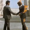
Did some photo-choppin of our old GW logo: 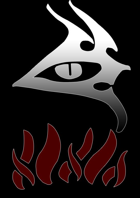 Needs a tad bit of polishing, but looks pretty good. |
|
|
|
Post by shobiz on Aug 5, 2012 14:53:22 GMT -6
i like it *thumbs up*
|
|
|
|
Post by willard on Aug 9, 2012 19:07:56 GMT -6
pretty neat...i like the smoke/fire thing going on
|
|
|
|
Post by kassats on Aug 9, 2012 19:17:09 GMT -6
Nice.
|
|
|
|
Post by Loggahead on Aug 9, 2012 20:31:21 GMT -6
pretty neat...i like the smoke/fire thing going on Hah! Thanks! See, it's not just a clever name... wait... maybe it is.... ;D |
|
|
|
Post by crowfl on Aug 11, 2012 6:48:26 GMT -6
WOW very nice Logga
|
|
|
|
Post by Loggahead on Aug 11, 2012 7:19:49 GMT -6
Yah! Thanks! This is our current cape design in GW1. I took a screenshot and then vectorized it in photoshop. Unfortunately, in the current embleming engine in GW2, I can't replicate it or even come close to it  That bummed me out. |
|
|
|
Post by sawmark on Aug 11, 2012 7:38:07 GMT -6
Very nice!
|
|
|
|
Post by jade on Aug 11, 2012 8:30:39 GMT -6
|
|
|
|
Post by Loggahead on Aug 11, 2012 9:46:04 GMT -6
Thanks for that link! Here is what I created during the stress test:  It was the best I could do... It's about the only emblem with fire in it at all! hah! On a sidenote, because it is a simple and clean logo, it looked really good on the weapon and armor previews. The off-white color of the dagger looked more natural on items vs pure white. |
|
|
|
Post by jade on Aug 11, 2012 9:53:17 GMT -6
yeah - i like this one too - the other ones i thought for S&F would be something with the phoenix in it ( and the off white is much better than the pure white)
|
|
|
|
Post by Drittunge on Aug 13, 2012 21:14:11 GMT -6
Looks pretty good. The logo definitely needs fire!! Maybe some smoke will appear in the full release. We can always hope!
|
|
|
|
Post by shobiz on Aug 13, 2012 22:21:37 GMT -6
*fingers crossed* lol
|
|
|
|
Post by thegudge on Aug 14, 2012 8:28:42 GMT -6
Cool!  |
|
|
|
Post by Phoenix on Aug 18, 2012 19:26:29 GMT -6
Looking Good!!!
|
|
|
|
Post by morgwath on Aug 18, 2012 22:44:18 GMT -6
What about adding the gray brush stroke for smoke so it looks like this 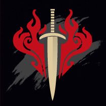 |
|
|
|
Post by ralimar on Aug 18, 2012 23:16:04 GMT -6
Very neat.
|
|
jen
Ashes
 "Nothing is impossible, the word itself says I'm Possible!"
Posts: 33
|
Post by jen on Aug 18, 2012 23:22:56 GMT -6
 looks good looks good |
|
|
|
Post by Slovo on Aug 19, 2012 0:07:10 GMT -6
Not too shabby.
|
|
|
|
Post by thost on Aug 19, 2012 7:33:53 GMT -6
Very slick!
|
|


 That bummed me out.